Have you ever tried to look up a clinic’s website on your phone and ended up pinching the screen, scrolling around just to find the number, or giving up altogether? It's frustrating, right? Now think about your patients doing the same on your site.
The truth is, most people check out a clinic online before calling or walking in. Guess what? They’re not sitting at a desk. They’re lying on the couch, rushing between errands, or searching during lunch breaks, on their phones. That’s exactly why your clinic website needs to be easy to use on every screen. If it's not, you're losing people before they even meet you.
This blog is for clinic owners, managers, or anyone running a healthcare practice. We’re going to walk through what it really means to have a responsive website, how it helps build trust, and how it quietly but powerfully brings in more patients.
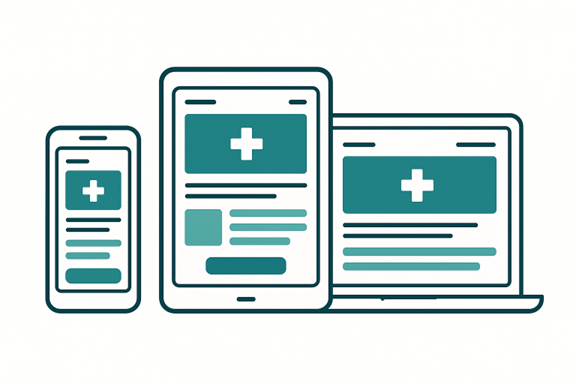
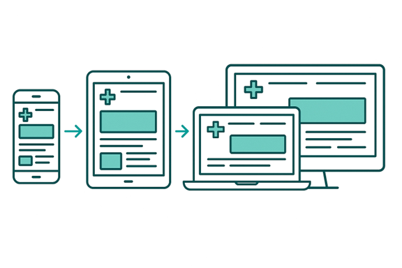
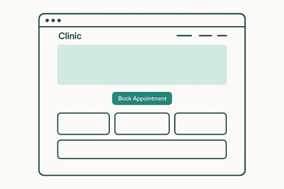
The word “responsive” sounds like something out of a developer’s handbook, but it’s actually simple: a responsive website is just one that works properly on any device (phone, tablet, laptop, desktop) without the visitor needing to fight with it.
So, what does that look like in real life?
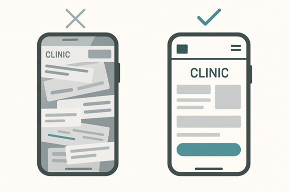
Well, let’s say someone is lying in bed at night, looking for a new therapist or pediatrician. They click on your site on their phone. A responsive site will:
A non-responsive site?
That person is stuck pinching, scrolling sideways, and wondering where the heck their hours are listed. Most people won’t even wait 10 seconds; they’ll hit the back button and move on to someone else. That’s just how people use the web now.
People visiting a clinic website usually aren’t “just browsing.” They’re often stressed, tired, or in pain. If your site gives them a headache before they even make the appointment, you’ve already lost their trust. Harsh, but true.
Remember, a lot of your first-time patients have never called you before. Your website is your first handshake, your first smile, your front desk, all rolled into one.
Here’s something you should keep in mind (write it down if you need to):
Not fair? Maybe. But it’s the way people think online.
Most clinics assume patients only use phones, but the real issue is device switching.
Someone may:
If your site breaks, takes time to respond, or behaves differently on each step, they feel the friction immediately.
A non-responsive website disrupts the patient journey. Even a small glitch (a form that doesn't load, a button that shifts, a font that shrinks) can cause patients to abandon the process and try another provider who feels “easier.”
This is of the utmost importance because around 52% percent of patients will abandon your website if it doesn’t work properly on their device. Most clinics don’t even know this is happening, but now that you know – work on it.
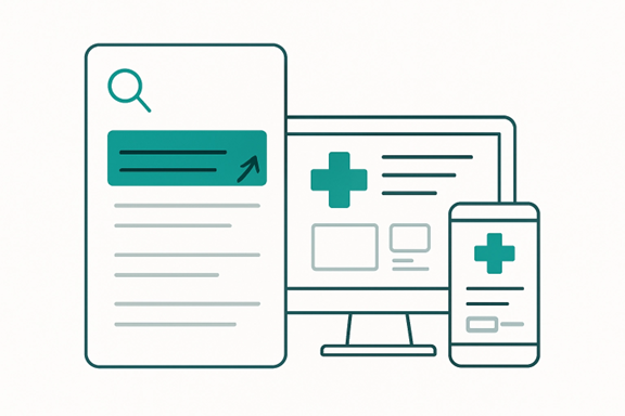
A responsive website design also improves how search engines view your clinic. Google favors sites that load fast, look clean, and work smoothly on mobile, which leads to better rankings and more clicks. And here’s something worth noting: about 79% of healthcare providers want to use SEO to connect with more people. If your site isn’t responsive, you’re already behind the clinics that are optimizing for visibility.
So instead of judging your website only by how it looks on your laptop, think about how Google evaluates it. A non-responsive site drops in rankings, which means fewer people find you, no matter how great your services are.
Most people judge businesses by their websites. You probably do it, too. If a site looks old, cluttered, or hard to use, it instantly feels sketchy. Even if the clinic behind it is fantastic, that first impression is already ruined.
Now imagine someone is looking at your site for the very first time. They’re nervous. Maybe they’ve never seen a doctor in years. Maybe they’re debating whether to finally book that check-up. And then your site takes forever to load… or nothing fits their screen… or the text is tiny.
They don’t say it out loud, but in their head? They’re thinking, “Eh… maybe not.”
People don’t want to feel confused, and they don’t want to feel like they’re stepping into something outdated. A responsive design tells them:
None of that requires you to be fancy. You just need to be functional—and a little thoughtful.
(That matters more than you think.)
If you skip responsiveness, you’re not just risking a clumsy layout. You’re risking security problems. Older, non-responsive websites often run on outdated templates that can’t keep up with modern browsers or security updates.
When that happens, your site is more likely to break, malfunction, or expose sensitive information.
Common issues include:
And in healthcare, these problems are serious. Your website needs to protect every form, message, file, and appointment detail. A responsive, modern build supports stronger safety measures like:
When people know that their private information is safe and the website is quick and responsive, they will return again.
Getting people to your website is great, but that’s not the goal. The goal is to get them to do something: book, call, or walk in.
And a responsive site? That’s what makes it easy for them to act.
People Take Action When It's Effortless
Most visitors don’t have time to poke around. They want to know:
If the answers to those aren’t clear (or if the site is slow, confusing, or broken on mobile), they’ll leave. It’s not personal, but they’re just in a hurry or distracted. So, when your site loads fast, buttons are easy to find, and forms work on any screen? They’re way more likely to reach out.
Let’s say someone opens your clinic website while sitting in the car (not driving, hopefully). They tap your site and immediately see:
A lot of clinics forget that telehealth doesn’t start inside the video call. It starts on your website. Patients usually join their appointment through a link on your site, a patient portal embedded on your site, or a mobile interface that your site triggers. If that page isn’t responsive, the telehealth experience won’t be either.

This is especially important in dermatology or dental practice web design, where providers rely on clear visuals to assess swelling, rashes, redness, gum concerns, or tooth sensitivity. If the telehealth page doesn’t adapt to a phone or tablet, patients struggle to show symptoms clearly, and communication becomes harder.
A responsive site keeps the telehealth interface clean, readable, and easy to use on any device, which helps both the clinic and the patient get a smoother, more accurate appointment.
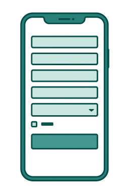
Most patients fill out forms when they’re not sitting at a desk. They might be on a lunch break, in their car, or relaxing at home with only their phone nearby. That means every part of your patient intake process has to work smoothly on smaller screens.
People complete many important tasks on mobile, including:
When a form breaks, freezes, or forces them to pinch and zoom, the process stops instantly. Patients get frustrated, close the page, and often never return. A responsive clinic website prevents this by automatically adjusting forms into easier layouts, like simple single-column designs, larger tap-friendly fields, clearer step-by-step sections, and auto-save support that protects their progress if the screen times out.
All of this matters because form abandonment is one of the biggest reasons clinics lose online appointments. When your forms work smoothly across all devices, more patients complete them, more appointments get booked, and your clinic avoids losing people simply because the technology got in their way.
This happens all the time. Someone builds a beautiful clinic website, but only tests it on a big screen. They don’t even open it on a phone. But your patients aren’t on a desktop. They’re in line at the pharmacy, sitting in a car, or scrolling at night while their kid sleeps.
Sliders, pop-ups, background videos, all these sound cool, right? Until it slows everything down and confuses the heck out of your visitors. Most people just want the basics: what you offer, how to contact you, and when you're open.
If your site takes 8 seconds to load because of all the “features,” you’ve already lost the appointment.
Sure, that template might look great in a theme preview. But does it support click-to-call? Can it handle online booking? Does it follow healthcare privacy basics?
Most generic templates don’t.
That’s why working with someone who’s actually built medical websites, or understands responsive web development, can save you time and headaches.
Even if your site looks good, if it’s slow? It’s a problem. Google ranks slower sites lower. And people won’t wait for a page to load when they’re in a rush (which is most of the time).
A few things that usually cause slowdowns:
You don’t have to go all in on tech speak, but you do want to ask your developer, “Can we make this load in under three seconds?” That one question can change everything.
This part matters more than most people think. A solid developer won’t just ask what colors you like or what pages you want.
They’ll ask things like:
If they skip this and jump straight to design ideas, that’s a red flag.
Because your website should be based on patient behavior, not just what looks good on a monitor.
A real responsive web development team doesn’t build a desktop site and then “shrink it down.” That’s old-school and never works right. Instead, they design for the smallest screen first, because that’s where most people will visit from anyway.
That means:
If it works on mobile, it will work everywhere else too.
Testing isn’t just about checking if the site loads. That’s why top healthcare marketing agencies always…
And they’ll fix anything that feels clunky, confusing, or broken.
Here’s a trick to check your site: Pretend you’re a patient visiting for the first time and try to book an appointment on your phone.
Some folks disappear after launch. Then you’re stuck Googling how to fix stuff. Look for someone who offers support or at least trains you on how to manage updates. Even basic things like changing holiday hours or swapping out a staff photo shouldn’t be a struggle.
And if you’re thinking about going deeper, like improving how you show up on search engines or building a site that works hand-in-hand with your marketing, you might want to talk to a medical SEO agency. Some specialize in small clinics and can help with both the tech and the strategy behind it.
(But don’t worry, you can always start small and grow from there.)
To wind up, your clinic website is your digital front door. For many of your future patients, it’s their first impression of you. If it isn’t responsive, doesn’t load quickly, or doesn't work on a phone, you’re closing that door before they even knock.
You’ve probably spent years building your practice. You care about your patients. So, your website should reflect that care, too. Responsive design helps you with that. It’s all about being available, reachable, and professional.
Whether you’re running a family clinic, a small dental office, or a mental health practice, you deserve a site that works for you and works for the people who are trying to reach you.
Start simple. Ask the right questions. Make small updates if that’s all you can do right now. Remember, if your site works well for your patients, your clinic works better overall. That’s a simple upgrade that brings real results, both online and onsite!
Similar, but not the same. A mobile-friendly site may (sort of) work on a phone, but a responsive website actually adjusts itself based on screen size. That means it looks right and works right on a phone, tablet, or computer, automatically.
Not always. Costs depend on how complex your site is and who you hire. But many small clinics start with a simple, clean design and build from there. Ask for a quote based on just the essentials: home, services, about, and contact pages. That keeps things affordable while still giving your clinic website a strong base.
Maybe, but not always. If your site is fairly new, a developer might be able to adjust your layout and fix key areas without a full rebuild. But if your site is more than 5 years old, starting fresh may be faster and more cost-effective in the long run.
It depends on your goals and the size of the site, but most basic redesigns take 2–4 weeks. This includes planning, design, testing, and feedback rounds. More complex builds with booking tools or patient portals may take longer.

